World of Threads Festival
Quiet Zone
2012 Exhibition: Gallery
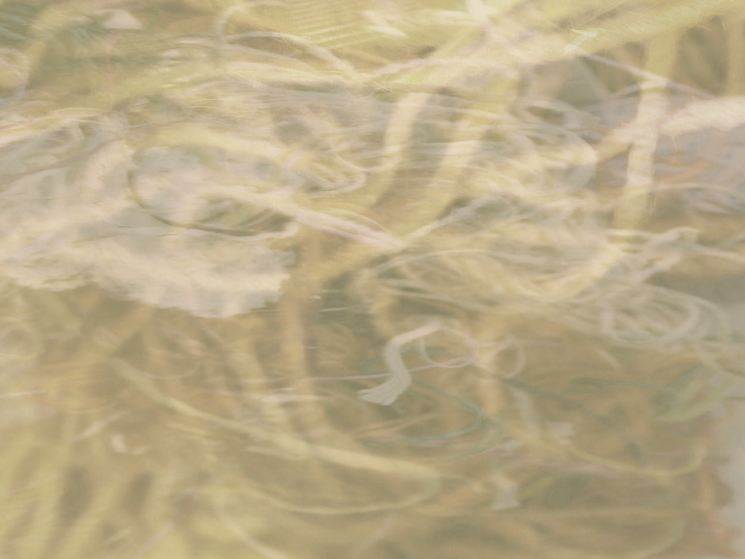
For this major exhibition Festival Chair/Curator, Dawne Rudman, was most caught by the submissions in neutral colours and from this an idea emerged. Neutral colours are often used as a background or to give a highlight to something. However, they can also be elegant, alluring and strong, deserving prominent recognition in their own right. Ranging from the blacks with their shadowy hues, to the chalky whites, the work also explores the cafe au lait, sand and tan shades. The result is a rich range of opposites and complements. There are fragile pieces, which almost beg for protection. Others while being multi-layered, are very revealing. Some are made of silk or paper adding to their delicate appearance, some have a luminous quality, and some cast gentle shadows.
Photography by Gareth Bate

Curator
- Canada: Ontario: Oakville: Dawne Rudman.
Artists
- Austria: Vienna: Kerstin Bennier
- Canada: British Columbia: Nelson: Maggie Tchir, Rossland: Kathleen Hill, Summerland: Barbara Wellborn. Ontario: Brampton: Chamila Belleth, Cambridge: Nancy Yule, London: Dagmar Kovar, Manitoulin Island: Judy Martin, Mississauga: Pat Hertzberg, Oakville: Ixchel Suarez, Peterborough: Kelly O'Neill, Toronto: Lorena Sandin Andrade, Yael Brotman, Lisa DiQuinzio, Lisa Kemp, Valerie Knapp, Colleen A. Lynch, Rochelle Rubinstein. Quebec: Montreal: Ariane Lavoie.
- France: Lyon: Domonique Arlot.
- Ireland: Co. Kildare: Saidhbhin Gibson.
- UK: Cambridgeshire, Cambridge: Catherine Dormor.
- USA: California: Los Angeles: Lori Zimmerman. Michigan: East Lansing: Xia Gao. North Carolina: Raleigh: Megan Bostic.

Gallery
- The Gallery at Queen Elizabeth Park Community and Cultural Centre.
City
- Oakville, Ontario, Canada
Dates
-
- Nov. 2 - Nov. 18, 2012


Synchronistic Curating
Something that's different about World of Threads Festival is that we let the art guide us. Festival curators Gareth Bate and Dawne Rudman don't have predetermined curatorial ideas or impose our concepts on the artists. Each new festival is a blank slate. Shows develop entirely out of the submissions we receive.
To find our main exhibitions we look for connections and common themes between thousands of artworks. These works were made by hundreds of artists from around the world. Often artists seem to be on the same wavelength during a particular period. Over time, through many hours of sorting through artworks, the exhibition themes just emerge and become clear to us. This method has been very successful and resulted in compelling and unique exhibitions.


What was the overall theme of this exhibition?
The main theme for the exhibition was colour. While viewing the submissions for the Common Thread International, I was most caught by the work in neutral colours. The more I looked, the more pieces in neutral shades came to my attention and I was drawn to them.
Neutral colours are often used as a background or to give a highlight to something. However, neutral shades can also be elegant, alluring and strong, deserving prominent recognition in their own right. Ranging from the blacks and charcoals with their dusky, shadowy hues, to the frosted, milky, or chalky whites, the work also explored the café au lait, creamy caramels, sand and tan shades. For this reason, I decided to make colour the focus of the show.


A secondary theme developed of opposites – not only in contrasting colours/tones, but also between strength and delicacy. A rich range of opposites and complements was the result, made more exciting by the variations in texture. There were fragile pieces, which almost begged for protection. There were others that in spite of being multi-layered were very revealing. Some were made of silk or paper adding to their delicate appearance. Others had a luminous quality and some cast gentle shadows.
And now, while looking back on the works for this interview, it has dawned (pun intended) on me that there are a number of pieces that featured circles in one form or another.
All their differences aside, the work in the exhibition engaged the viewer in a remarkable visual feast of blending and intertwining hues and textures.


How did you select the artists/work?
There was no pre-determined theme for my show. All the submissions were viewed and as I have mentioned earlier, a theme started to emerge during the viewing process. Once I had settled on the theme, it was a case of selecting other pieces that worked within the theme and which I felt would portray the overall vision I had for the exhibit.


How did you come up with the title for the exhibition?
I cannot lay claim for coming up with the title. In discussing the theme with a friend, he suggested Quiet Zone, which sounded perfect. Thank you JGJ.
Many visitors commented on the title and how appropriate they felt it was and how beautifully it worked with the exhibit as a whole.


